In my “other role” as Secretary of Blackfriars (Agnes Scott’s very own theater troupe), I am in charge of all publicity for this years’ productions. It has often occurred to me that many of the things I do are related to the non-writing side of writing—editing and publication. Sometimes how your words are laid out is just as important as what they say, especially in the realm of publicity and general attention-catching-awesomeness. So for all of you aspiring publishers, even if the extent of that ambition is making posters for campus events, here are some tips to make them dazzle. 1. Layout : Keep it neat. The less number of words you can use to get your point across, the more likely it is that people will pause on their way to get a biscuit and read about your event. Humans are simple creatures, and our eyes are attracted to large or bold words first—but watch out for the catch. IF ALL YOUR WORDS ARE EQUALLY HUGE NONE OF THEM WILL BE MORE IMPORTANT THAN THE OTHERS AND YOUR SIGN WILL NOT ATTRACT ANY MORE ATTENTION THAN IF ALL THE WORDS WERE TINY. The golden answer to this conundrum is to increase the size and prominence of important words in order to draw your viewer’s eye to the title, time, or place for your event. Keep the witty catch phrases and less important details smaller—you’ve got to hook ‘em before you can entertain ‘em. 2. Font: The best kept secret about publishing regards serif fonts versus sans serif fonts. Times New Roman has little ticks at the tops and bottoms of every letter—serifs! Arial does not. Hence, Arial is a “sans serif” font. The human eye naturally is drawn toward sans serif fonts, but prefers to read blocks of text with serifs neatly in place. This is so important for fliers—put your title in a large clear sans serif font, and other info smaller and be-serif-ed. I promise that this is the rule all professional publications go by, and it will greatly improve the readability of your signage. One last warning: don’t go font crazy. Use two or three fonts, tops, on any one sign. Your readers will thank you. 3. Images: Everyone loves cutesy clip art and lolcats (well, I don’t, but I’ve been told that I may be the only exception in the world). Images are a great way to draw attention. However, they work best as single, large, clear image, particularly something vivid that can become emblematic of your event. Think of the most memorable posters for movies or plays--The Silence of the Lambs, The Phantom of the Opera, The Dark Knight--all of these have a single image associated closely with them—the white face with the moth over its mouth, a half-mask, the Joker’s creepy image. Go simple and memorable, and you won’t regret it. 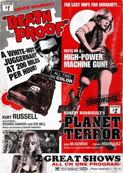 Multiple images and no main focus make for a distracting poster 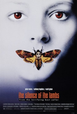 Clear memorable image and fewer words tend to draw an observer in much better With these ideas about layout, font, and image, you can bring the masses in to your events and have them stealing the posters off the walls. To frame. Because they’re just so great.
Promise. ---- Molly Saunders is a sophomore English Lit major and Writing Center tutor.
9 Comments
Elizabeth Berkstresser
2/3/2010 02:12:55 am
Wow. This will really help me when publicizing my next event!
Molly
2/9/2010 01:28:41 am
Thanks guys! Shannon, I was an intern at The Red Mountain Review, which is a literary magazine published out of Birmingham, AL, and the editor was always going on about serifs...it really is true, though!
Lucia
2/15/2010 10:05:36 am
Great tips on the fonts!!! Also, I don't like lolcatz (is that how you say it?) either. 5/7/2012 10:53:19 am
A handbag or just a bag as well as pouches are bags that happen to be normally used by women to hold their belongings. Most of these bags are made as per the fashion. A purse is actually a small bag which is used to 5/7/2012 12:07:50 pm
coach in many countries have agents that can be searched, in China he has become our consumer goods. Hong Kong and Shanghai have already have a coach of the store, but Japan also introduced a coach that expensive, luxury brand, became his second of the Kingdom. We always see the screen "C" word, many celebrities are a big fan of coach, can often present with a variety of parties, fashion styles you, beautiful colors, enough to attract the eye. Star advertising effect, so that more people understand that coach. 5/9/2012 04:16:59 pm
No matter what the field or specialty of your business, there is a coach out there for you. By considering your individual situation and working to meet the long and short term goals of your business, business coaching will help foster your company's growth. 5/9/2012 07:05:37 pm
Except for availing goods, on the list of exclusive attributes and even expertise in web based store shopping is without a doubt going without shoes can certainly meet your daydream family trip escapades. Leave a Reply. | Blog posts are written by a range of students from Agnes Scott College. Some are tutors at the Center for Writing and Speaking. Others are students who engage in writing through local festivals and events. ArchivesApril 2010 CategoriesAll |
 RSS Feed